
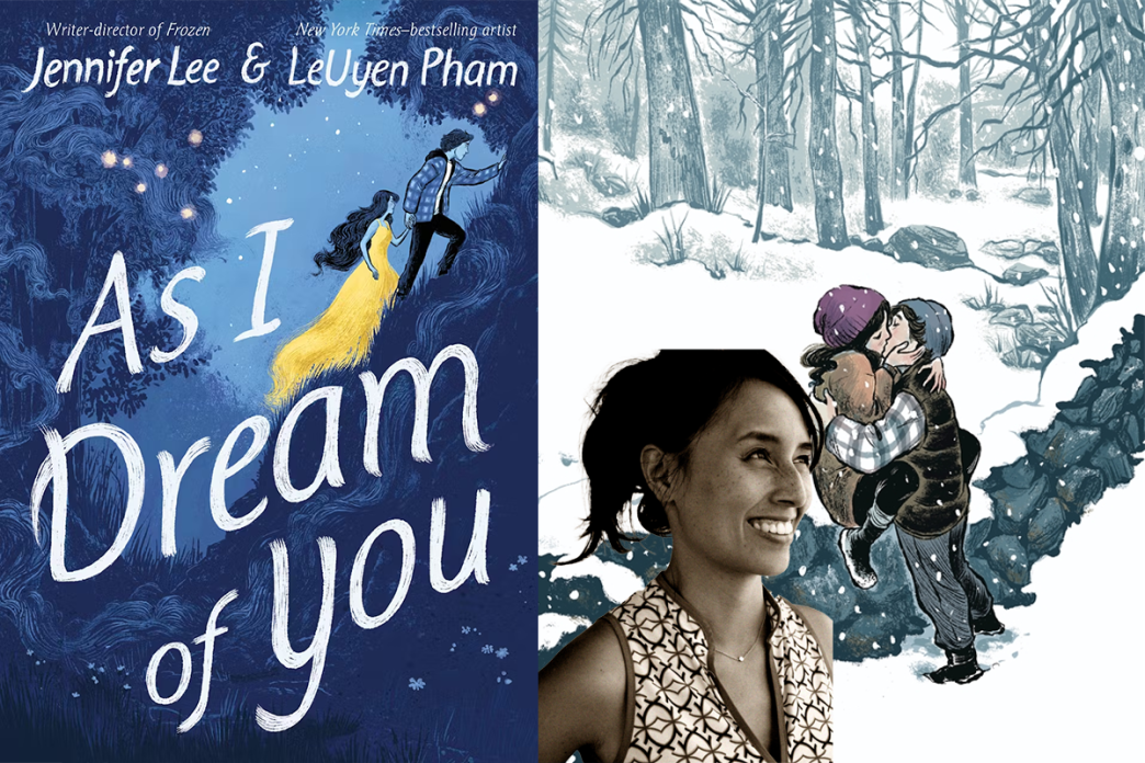

“As I Dream of You” is a modern take on the Orpheus and Eurydice Greek tragedy, that highlights young love in a small town and how far someone is willing to go to be with their person forever, even if it means losing their own life. We chatted with illustrator LeUyen Pham about her collaboration with writer Jennifer Lee and her process on making her words come to life. Check out our full review of the graphic novel here.

“We both recognized this cosmic wave we were both riding…”
Vanessa Young: Can you talk a little about your partnership with Jennifer and how you made her words come to life? Was it more of a collaboration?
LeUyen Pham: We’re getting right into it! Almost all of my graphic novel projects have been collaborations with the writer, when I’ve had access to them directly and there’d be some back and forth between us as I progressed, at least in the earliest stages. This book was an odd exception. I was given the script without knowing who Jenn was, which allowed for a pretty unbiased initial reading. It was just such a perfect script — slender at only 96 pages, with just enough detail to set the imagination going and not throttle it on the way. Jenn is really an economical writer, and consequently, a really generous one — she left a lot of room on the page for the artist to interpret what she was writing. The things that were clear, though, was that such precision of word meant each word carried massive weight.
I knew she wouldn’t introduce a concept without repeating it as a motif later in the story. The references to Orpheus and Eurydice were more plain early on, but as the story we were telling mirrored the story of these Greek lovers, the more I would try to reinforce that theme through the art. The poster hanging in Franny’s room is an image of Orpheus and Eurydice. The wall motif throughout the book, which represents the division between the Underworld and the world of the living, is emphasized time and again as something the two do not cross. I even suggest a wall on one page by framing the lovers on opposite cliffs, and use the center book fold as a way to keep them separated. There’s a recurring motif of a sheet as well, as when Sam recalls the death of his mother being associated with “crawling out of a sheet on the other side.” I used that suggestion of a sheet often in the story, most notably toward the end of the book, when we crawl out of Sam’s nightmare to confront his reality. I was doing all this because I knew the script as written allowed me to do it.
Early on, I would be sending off these drawings to both the editors and to Jenn. And for this book, it was amazing — they never sent back notes. It’s like we both recognized this sort of cosmic wave we were both riding, and it had little to do with who we were as artists and more to do with the story we were telling being its own thing. That’s the only way I can explain it. In fact, we never met until after I had completed the work, and we were thrilled to discover how much we really liked each other, and how grateful we were for what the other had done. Is that a collaboration? Maybe of the mind? That sounds corny, but it was very much that.
Young: How much of the design, overall look and feel came out of your head versus what Jennifer wrote? Did you change anything once you got started?
Pham: It’s hard to answer that one without going back to the original script and seeing what Jenn had originally written. I think when I’m reading a script, my brain starts playing the movie in my head, with the words written reinforcing that imaginary movie. Was it her descriptions that gave me the images, or was it the impressions her dialogue was leaving me with that produced the mood? Or was it my own brain filling that in? I had to glance over Jenn’s script again to discover, to my surprise, how little she truly was describing a physical thing, and how much I was inferring from the words spoken by the characters.
The story is based on an event that happened in Jenn’s life, when her first love was killed in a boating accident, and she mourned him through a year of lucid dreaming, in which she was convinced their souls were truly meeting. I’m glad not to have known this, as when I started sketching the characters, I cast them in the way I saw them in my head. I wanted Franny to be Asian, possibly mixed, because I thought that background added an interesting layer to Franny’s own soul searching and inability to fit in.
Likewise, I saw Trudy and Jimmy Gibson as a biracial couple, thinking that such a couple, in the late 90s as I pictured the story, would have had their own struggles falling in love during the era of the Civil Rights movement, when some states still banned interracial marriage. And it meant that their grandkids, Josh and Jared, would be Black and would have their own complications in rural Pennsylvania. They were cast that way by me just so, as an artist, I could inject that extra conflict into their overall persona and keep them as fleshed out people. Jenn was thrilled with the interpretation, and I think it lent an air of vulnerability to the story that might not have been had the characters all been of the same racial background.
Far and away the craziest thing to interpret, though, was the descriptions of the dream world/underworld/real world the characters navigated through. Developing the look for each of these was its own challenge, and one that Jenn really left up to me to do. It’s definitely where, as an illustrator, I really had to tax my abilities to achieve the look we needed.
“Each of these realities had its own stylistic models.”
Young: When you first read the story, did you immediately know what you wanted to do in terms of design?
Pham: Not quite. I did go through a number of early designs, interpreting the dream world, that bordered a little heavily on caricature. I also did some early designs of the pulsating ball of lost souls that I pulled heavily from Rodin’s The Gates of Hell. And I played with color a lot. Overall, though, I had to go through the book and figure out how many realities I had to design, which turned out to be more than I initially thought. There’s the real world, where everyone is alive. Then there’s Sam’s version of the world, Franny’s version of the world, the dream world in which they meet, and then ultimately the Underworld. I spent a couple weeks just going through the script initially to separate each of these worlds with a highlighter. Each of these realities had its own stylistic models. Watercolor, heavy ink lines, chalky lines — each was reserved for a different reality. I’m known for changing styles a lot in my children’s book work, so this wasn’t unknown territory for me. But it was DEFINITELY challenging.
“…the ultimate sign that the writer is confident in her writing.”
Young: I appreciated the spreads and pages that had absolutely no dialogue but the story was driven by the art and done in such a way that it felt like we were still reading even though there were no words to read. How do you decide what panels or pages get dialogue and what’s better suited to visuals only?
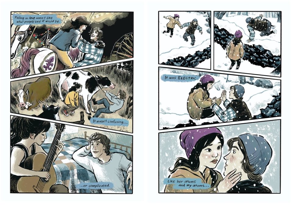
Pham: The interesting thing about a slender script is that a single description, such as a “IN THE SNOW COVERED FOREST – DAY. Franny follows Sam on the search for chestnut trees. They come upon a wall” could take up an enormous amount of space to render. It is not stated in the description, but I understand the point of the chapter being that these two characters are falling in love. So they aren’t just walking through the snow or coming to a wall. They make a deeper connection with each other, and through this setting, the acting has to convey that action that the script suggests, but doesn’t say. In fact, the third chapter of the book is titled “Falling”, in reference to them falling in love.
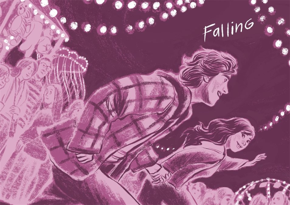
The script for this whole chapter was only two and a half pages long. I turned that into 16 pages of art, because I knew that this was the chapter in which not only are the characters falling for each other, but the AUDIENCE had to fall for them as well. If we don’t become part of their love story, then we’re not invested in what happens through the rest of the book. So I put in a lot of extra images that gave the space for that to happen. This need for extra breathing moments happens throughout the book, much to the credit of my editors, who would afford me the pleasure of an extra couple pages with nothing but flowers on a double page spread, or a hand dipped in a running brook, or a soul swirling around Franny in a dream state. It’s the intersection between my job as a graphic novelist and my desire as an illustrator collide on the page.
And here I have to say that Jenn was FABULOUS in this regard. There would be whole passages that she removed AFTER she had seen my drawings, with the explanation, “You showed it in the art. I didn’t need to say it in the words.” This is pretty generous as a writer, and to me, the ultimate sign that the writer is confident in her writing. Like building a completely sound structure with the most minimal of supplies. Really amazing.
Young: The lettering, the colors, the way certain pages are laid out are so engaging, it’s hard to put the book down. What was the most challenging or difficult thing to physically draw?
Pham: All of it. Seriously, this book was hard to do. When you’re given a precise script, you have to respond in kind with precise drawing. Or more correctly, precise acting. I really had to pull out my acting chops on this one. I drew and redrew and redrew panels to get the facial expressions and body language just right. In the same way that the script suggested mood without having to say it, the images had to provide that mood without hitting you over the head. There’s a lot of psychology in the setting up of these pages. The lettering, too, was pretty deliberate. I designed a font that was used in all the worlds except the dream world and the Underworld. In those realms, I hand drew the lettering, to keep it from feeling grounded. It’s the same lettering that’s used for Jimmy Gibson when he speaks, as he is the one character that is half in the real world and half in the other world. All of these little decisions are pretty precise.
“Things are revealed if you’re looking for them.”
Young: Color was used very sparingly so when it was used (the sunset spread with Sam in the trees, for example) it had such a large impact. Can you walk me through how you planned the use of color?
Pham: I love playing with color and using it to build meaning in-story. In this book, the worlds are definitely separated by how the color is treated. Sam’s world is gray and desaturated, as Franny’s absence has stolen color from him. Franny’s world has no black in it at all — the world is over-saturated, as she says in the story. My husband once described to me his feelings after his father died. He said that colors seemed to be almost an affront to his senses — how could the world continue to be so beautiful when someone he loved had passed? As though the world is indifferent to suffering, it continues to be too beautiful and too bright in the face of death.
I used that idea when I colored Franny’s world. Franny is also represented by purple and yellow throughout the story — random color choices but used persistently enough to know when you’re seeing the world through Franny’s eyes or not. Sam’s color is blue — the same blue outfit throughout, blue eyes, blue dialogue boxes to Franny’s yellow dialogue boxes. Josh and Jared both have very neutral black and white coloring, as they both have resided in the in-between world for so long. Sam’s nurse, Kitty, is attached to white and light colors, and more importantly, has a symbol associated with her. Her tattoo is an ancient Celtic symbol that, if you understand what it means, will give you a hint to the end. The symbol is found on her wrist, as well as on a hanging mobile outside her cottage. And the shape of the design can be seen in compositions throughout the book, again as a hint to the end of the book. In fact, if you really pay attention to color shifts, from the color within the panels to the color of the panels themselves, all of these things hint toward the ending. In the same way that the writing is designed for the “Aha!” moments on a second reading, the art is designed in the same way. Things are revealed if you’re looking for them.
Interestingly, the Underworld was one of the first chapters I finished in the book, though it’s the penultimate chapter. I knew I wanted that world to be devoid of color completely, so that when the characters could move onto the afterlife, represented by the sunset, the contrast would be as strong as possible. I painted that whole chapter understanding that, and knowing that the rest of the book would have to work up to this conclusion, and it kept all the spreads on track. The last chapter is the only chapter where the color is extra saturated, where all of life comes forward.
Young: Did you know much about the myth of Orpheus and Eurydice before you got involved with this project? What, if anything, about that story inspired how you approached the art for this book?
Pham: Yes, it’s one of my favorite myths. Jenn puts in a lot of red herrings to keep us surprised, such as Franny playing the guitar rather than Sam. What’s compelling about that myth is that it’s actually a contemplation on what grief is. And that is exactly what this book is about as well. These characters have no choice but to go through their grief to reach the other end, when they can finally accept that they have been parted forever. With that understanding, in the first few chapters of the book, when the two are in love, I keep the space between them as minimal as possible, so that the audience interprets them as a single being, almost, just like that feeling you have when you fall in love for the first time and you feel no division between yourself and the person you’re in love with.
As much as possible, Jenn and I are trying to show them breathing together, in the same space, as one. When the tragic fourth chapter happens, from this point on, I tried to show how the two characters are physically separated from each other as much as possible. The first time they see each other, they’re actually separated by the page divide itself. The motif of the wall again! This happens time and again as they interact with each other in the dream world — the presence of a wall coming between them, manifested in the end by an actual wall separating life and the afterworld. And the last image you see of the two on the same page, that wall has become a separation in their minds as well. All of this mimics the myth itself — there is no cheating death, but death is not the end.
Young: Was there a particular panel or page that was your favorite to draw?
Pham: Quite a few! I loved doing the image of Franny being consumed by the lost souls. Its inspiration is the Arthur Rackham drawing of Alice in Wonderland being attacked by the playing cards. I loved making the image of Sam basically haunting his father, who is planting flowers at the grave. The entry into Sam’s mind at the time, as well as the joy of utilizing the medium of graphic novels to allow the words themselves to have physical weight, like weapons, on the page is so satisfying. The scene of the two in the fun house was a lot of fun to realize, with the creepiness of the mirrors and the jittery feeling of a nightmare pervading.
But honestly, one of the most meaningful scenes for me was a quieter image — Franny and her mother talking on the porch, in a moment where they share a quiet intimacy as mother and daughter. The casualness of the moment, when the mother reveals what her own dreams were, and that Franny was always in those dreams, I found it so touching. I think it’s because I’m the mother’s age, but in that moment, I’m still Franny. I keep the moment focused on her face, her reactions, with the mother relegated to just a portion of her on the panel, enough to provide a presence but not enough of a comfort. It’s a moment I hope, again, the audience feels more than reads.
“Having a background as a layout artist is pretty invaluable when it comes to understanding the breakdown of a scene…”
Young: You spent time as a layout artist for Dreamworks and are now illustrating book after book, how do the two processes compare in terms of staging or structuring a scene?
Pham: Having a background as a layout artist is pretty invaluable when it comes to understanding the breakdown of a scene, as well as why certain angles and lighting can manipulate how the audience reads an image. The thing working in animation afforded me is that I learned how to draw very quickly, and how to quickly structure an image to communicate an idea that might be complicated. That background definitely lends a cinematic quality to a lot of what I do. That’s not always desired in illustrating kids’ books — sometimes, I’ve had a hard time letting go of some of those concepts in order to get to something more interesting in design than in the framing of the design. But for graphic novels, it’s pretty helpful. So much of this is about timing, beats, an extra moment to dwell, a surprise turn of the page. Also, that animation training means that before I start any project, I usually have a slew of drawings done in advance to help establish the look. A character line up, location sketches, inspirational sketches — all the things a studio does before tackling a movie, I do the same for books.
Young: What next projects do you have coming up that you’re able to share?
Pham: Ooh, boy, a lot. I just released a picture book with Laurel Snyder called “Shrinking Violet”, which is a fairytale about a girl who shrinks when she’s frightened, and learns to control this when her friend Bird is injured. It was completed right after I’d finished the art for “As I Dream of You,” and I painted it in bold gouache colors and strokes that felt so liberating after having done these meticulous inks for the graphic novel. My husband Alex Puvilland (illustrator of “Spillzone” by Scott Westerfeld) and I are co-illustrating “Madeline in the Underworld,” a graphic novel based on the “Madeline” books by Ludwig Bemelmans and written by his grandson John Marciano. I’m working on the next “Princess in Black” book with Shannon and Dean Hale, as well as the next “Kitty Corn” picture book with Shannon.
I’m starting work on my own graphic novel about growing up in suburban Los Angeles during the 80s, contrasting the stories of three kids from differing racial but similar socioeconomic backgrounds, and the expectations put on each of them consequently. That sounds like a lot — it’s basically about how I grew up fairly poor and turned to my imagination a lot to understand much of the world around me. Not to mention I have an imaginary friend who comes in the guise of Indiana Jones, but who I call Uyendiana Jones, a barely disguised version of myself as an adventurer. Just lots and lots in the pipeline!
“As I Dream of You”is on sale starting May 5, 2026.
Franny and Sam are each other’s entire world. So what do you do when your world ends? Frozen’s Jennifer Lee and Lunar New Year Love Story’s LeUyen Pham deliver a tour de force young adult romance with a supernatural twist.
FOR FANS OF:
- Intense YA romance
- Orpheus and Eurydice
- Character-driven storytelling
- Magical realism
- Lucid dreaming
- “Heartstopper,” “You’ve Reached Sam,” and “The Fault in Our Stars”
I am a published writer, full-time editor, an events and entertainment reporter and mother of one. Comic books, drag queens, women’s basketball, queer films and TV shows are my bread and butter.